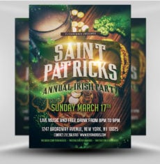
Every successful business must find customers and grow its audience.
No channel can meet all of a company’s marketing needs, but flyers are a cost-effective means of getting a large audience’s attention.
Are you launching a new product or service, announcing a sale, or hyping an upcoming event? We’ll help you create an eye-catching flyer design using one of our 1724 free or premium templates for Adobe Photoshop.
FlyerHeroes has the flyer template collection your business needs.
Our experience designing flyers means we know what a good flyer looks like and the right flyer colors to use.
Keep reading to learn more about the best colors to use for marketing and the flyer colors that will attract customers.
What Is the Best Color for a Flyer?

You want to use hues that attract customers, so use those that draw a person’s attention.
But not just any person: you need to capture the attention of your target market.
You must apply color psychology to select shades that evoke emotions in your target market.
What color is the most visually appealing? It depends on who’s looking.
Why Are Colors Important in Flyers?
Color palettes are important in flyer design for the same reasons they are crucial design elements in other marketing materials, branding, and even physical spaces.
Most humans see a wide range of hues, and these colors convey different emotions and personalities.
A Colorcom study found that we form impressions of brands within 90 seconds and that as much as 90 percent is based on brand colors.
Choosing the right color palette for your audience (which varies based on factors such as culture and gender) allows you to create the impression you want.
What colors are most convincing? Blue leads all others in this regard, so it’s no surprise that many financial institutions use it.
Red is energizing. Restaurants use it to stimulate diners’ appetites but must use the right shade. Upmarket establishments use a color palette based on muted, rich reds such as burgundy, whereas fast food joints use vivid scarlet to encourage rapid eating.
Choose colors that match your message, your brand, and whatever you are advertising with a FlyerHeroes flyer template.
How Many Colors Should Be Used in a Flyer?
It’s best to use two or three colors in a color scheme. Any more and a muddied color scheme can result.
There are two main exceptions to this rule:
- Using a full-color photo on your flyer
- Having tiny bits of other colors among your two or three primary colors
Humans can perceive as many as 10 million colors, but putting ten highly similar shades together will look like one color.
11 Creative Flyer Color Ideas
Use psychology and art theory so that the different colors in your design draw attention from your desired audience. Choose proven combinations and design best practices for maximum results.
FlyerHeroes is here to help you make the best design decisions with flyer color palettes that impress.
1. Make the Colors in Your Flyer Images Stand Out
If your audience can’t see what’s happening on your flyers, they won’t serve their purpose of communicating your message.
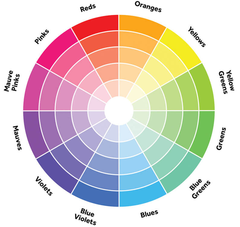
Choose a high-contrast color combination to maximize legibility. A complementary color palette is high-contrast, as is a three-way scheme that uses one primary hue and the two next to it directly opposite on the color wheel.
For example, blue, reddish-orange, and orange-yellow are bright colors that enhance flyer design.
Avoid combining red and green in your flyer design. These shades cannot be distinguished by people with red-green color blindness, which is the most common color perception anomaly.
2. Use an Image With Bold Colors for a Flyer With Impact
Aside from the flyer color palette you use, names are a vital part of branding and promotion.
However, your product or event may not have a super distinctive or memorable name, but if your event is meant to be exciting then you’ll still want to hype it up as much as possible.
Here at FlyerHeroes, we’ve found that it’s best to use bright colors like pink in such situations. A neon color palette is anything but subtle and the blast of color draws the eye and piques interest.
3. Choose a Combination of Primary Colors for Your Flyer
We learn primary colors first: red, blue, and yellow. All three together make for a fun, playful color flyer ideal for kids’ events or family days.
What is the most attractive color for advertising? Yellow is arguably the most eye-catching color, but different hues and combinations are suited to different promotions.
If primary colors are suited for your design but you want a more serious or professional look, tone down the color palette. Mustard yellow, reddish-orange, and navy look great together.
4. Distill the Emotion of Formal Events With Black and White Flyer Designs

Although not technically colors, black and white complement each other perfectly and look great together. One only has to look at the WWF logo design to see the power of a purely black-and-white design.
They are usually reserved for formal events such as funerals or white-tie dinners. Select a beautiful typeface and use these shades to create pure, elegant designs focusing on the words.
5. Choose Complementary Colors to Create Print Materials
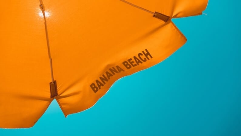
Consider the color wheel again. The primaries are red, yellow, and blue. These can be mixed to make secondary colors like orange, purple, and green.
These pairs of primary and secondary colors are known as complementary colors and lie opposite each other on the color wheel.
In addition to using primary and secondary colors to complement each other, you can also combine the two to create a third color for accents.
In this example, the primary color is blue, the secondary color is orange and when mixed they create a brown which is the third color used for the fonts in this image.
flyer colors based on your dominant color and its complementary color – such as purple and yellow or orange and blue – make a bold color contrast. However, red and green aren’t so great for people with color blindness.
6. Choose a Color Gradient for Your Flyer
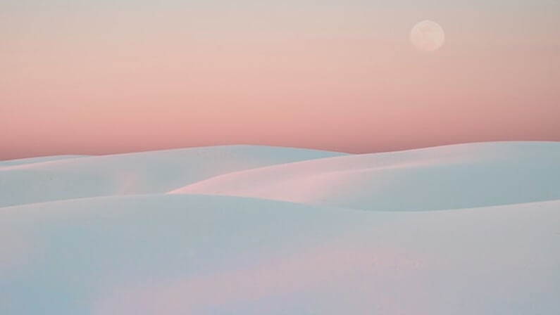
Rather than being a specific color palette, a gradient is the effect using two hues. Begin at the top of your flyer with one and let it transition smoothly into the other for a beautiful, natural effect.
7. Create a Monochromatic Flyer
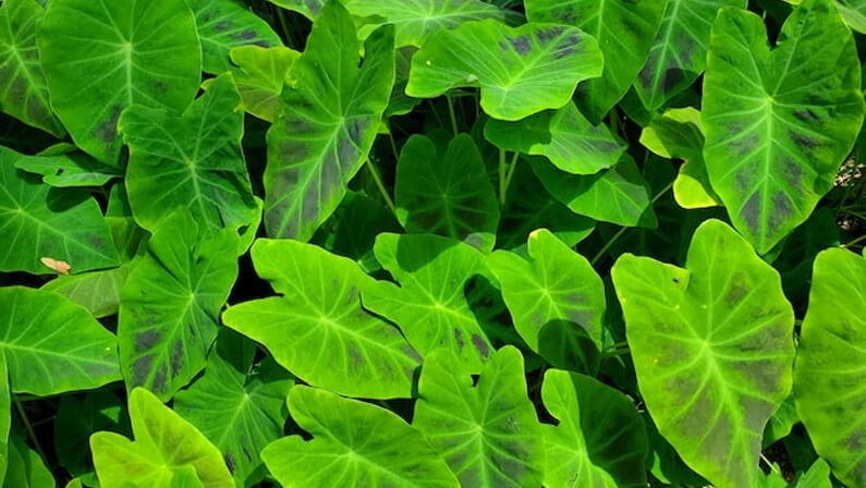
Sometimes, the best way to make your flyers stand out is to use a harmonious palette consisting of two or three variations of the same hue.
For example, one could use navy with blue-gray plus turquoise as an accent.
This subtle approach to color draws people in, so they linger on your design elements longer.
Are you in need of flyer inspiration? Look at our library of 1274 flyer templates and get the perfect one today.
8. Opt for Pastel Hues on Your Flyer to Elevate Mood

Bright colors, mainly primary or complementary colors, are bold and energizing. But electrifying color combinations appeal to only some.
Tone down bright colors and create a calming, soothing effect or a joyful, playful vibe using the same set of colors. Turn them pale and pastel by adding large quantities of white. Avoid any use of black or similarly dark shades.
Delicate pinks, sunshine yellows, and airy blues are great for beauty salons, cake sales, and baby clothing stores.
9. Enhance Concentration and Create a Flyer in Neutral Shades
If everything is exciting, nothing is exciting. This truism isn’t always applicable, but when it is, neutrals are your friend.
Color combinations involving light gray, sand, cream, or other neutrals allow you to put the focus on the main design elements.
10. Include an Accent Color to Emphasize Certain Elements
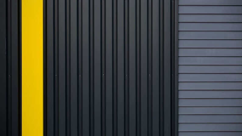
Because flyers are supposed to promote your brand, product, or event, try using a specific color to highlight key elements, such as the intended action you want customers to take.
Bright, bold colors are the best accent colors, typically warm hues such as red, orange, yellow, or pink.
11. Use a Mid-Century Modern Flyer Color Palette
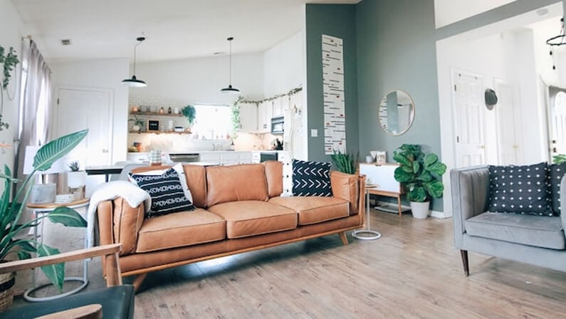
Mid-century modern is on-trend now. Capitalize on the popularity (and nostalgia) of this look.
Although you can use some cool neutrals such as black, gray, muted green, or grayish-blues, the foundation of these palettes is earthy tones. Use shades ranging from burnt orange through brown and ocher to beige to create most of the design.
Vivid accent colors such as navy, turquoise, chartreuse, yellow, or pink lend impact and can highlight important details or a CTA.
Incorporate Your Brand Colors and Logo
Sometimes, the right colors for your flyers are your brand’s colors. Creating your flyer with brand colors helps reinforce the color scheme of your corporate identity and builds brand recognition in your target market.
Flyer Color Best Practices
The best colors for marketing always match your brand identity, what you are selling, and who your target audience is. You can use simple palettes of two or three colors to enhance your flyer design elements with a well-thought-out color scheme.
When you see a hue you like online, use color selection tools to “steal” it for your designs. We recommend learning the basics of hex color codes and CMYK for printing so you know how your flyer will look when printed instead of on your screen.
Get Your Color-Optimized Flyers From FlyerHeroes
Whatever color palette you choose to fit your promotional needs, you can find a template to match at FlyerHeroes.
With many free and premium flyer design templates waiting to be customized with your pictures and info, Flyer Heroes is the best choice for PSD flyer templates
Subscribe to our pro membership for only $89 and get access to all of our flyers!


