
Flyers are lightweight, easy to carry around, and deliver messages in a compact format, which is why they’re such a potent advertising tool. Punchy, eye-catching, and informative, the best flyers use clever design tricks to draw readers into the content: brightly colored accents, bold typographic choices, and interesting textures make even the most mundane messages stand out. To generate the maximum amount of revenue, you need to give your target audience a little eye candy.
Create Separate Sections
One of the most important aspects of flyer design is organization. You can cram all your text into an ugly block and call it good, but your flyer will probably not perform very well. Well-planned layouts, on the other hand, make flyers more appealing and help drive sales and event attendance. When you present information to readers in a compelling way, they soak it up and internalize dates, products, prices, and contact information.
If you can, try to construct your flyer around three main blocks of text: a header; the most vital elements, and follow-on information. Effective flyer designs lead readers through those main informational components and invite them into the story. If you want to promote a party, for example, you put the name of the party at the top and then follow with a block devoted to dress code, date, and time. The entrance fee goes in a block of its own, and a small print sits at the bottom.
Focus on Typography
Carefully chosen stock images can make a flyer pop, but you can also build your design around typographic elements. If you want to draw attention to a street performance and assemble a crowd, for instance, your flyers need to make a bold and persuasive impact. In that case, you can increase the font size on a portion of your text to make the most crucial information stand out.
Designers in a hurry often add interest by leveraging the interplay between different font styles. Extravagant floral typefaces make great accent fonts, while simpler sans-serif options deliver key messages effectively. Distinctive slab-serif fonts work well for Wild West-themed parties, while handwritten typefaces look especially good on period flyer designs. For best results, stick to a maximum of three contrasting fonts and use the fanciest typefaces sparingly.
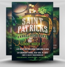
Go Retro
Compelling and nostalgic, vintage themes have been a design staple for decades. If you need to promote a classic car show or a 1950s-themed dance, you can’t go wrong with a little mid-century Googie-style flair. For inspiration, review a few vintage magazines, lose yourself in a code-era movie, or explore a collection of pictures from yesteryear. Tail lights on classic cars, aged photographs, and matchbook prints can help you come up with an interesting vintage concept.
Retro adverts from the first half of the 20th century can help you draft a great flyer layout. You can expand your collection of vintage typefaces via Adobe Typekit or by visiting a plethora of other font sites. To achieve the most convincing retro effects, read through a few vintage Photoshop tutorials, which are available both on Adobe’s site and on numerous design blogs, and use retro brushes to roughen artwork edges for a worn look.
Add Subtle Neon Accents
Bright and in-your-face, neon hues add pizzazz to nearly anything and work beautifully on festival and party flyers. Too much neon, however, can overwhelm even the best flyer design and make important information difficult to digest. To harness the power of neon without scaring your readers, try applying it economically and stick to muted colors elsewhere.
If your flyer has a dark background, you might create a digital neon bar-style sign to showcase your event title. For added realism, add a bright glow around your sign and let the light from your design element interact with other flyer components. Neon colors also work well in daytime-theme designs as well, where they create atmosphere and offer a sophisticated alternative to more traditional hues. To create neon shades in Photoshop, saturate colors completely and increase the brightness level until you’re satisfied with the results.
Make it Monochrome
Timeless and chic, black-and-white flyer designs work well in a variety of sizes. If you’re on a budget, monochrome flyers also tend to be cheaper to print and easier to produce in-house. Simple black-on-white chalkboard designs are ideal for casual events, while white-on-black flyers embellished with cosmopolitan typefaces make a great option for formal events.
Patterns come into play whenever you design in black and white. Chevron motifs, spots, and swirls make designs more fun without adding any chroma at all. Curved lines create a sense of depth and movement, bringing your monochromatic flyer to life in the process. To call attention to a vital piece of information, consider adding a rare pop of color to your two-tone design.
Add Texture
To add palpable elegance to your flyer, try making texture part of its design. Grungy layers give your project an authentic, handcrafted look and add visual interest to your concept. The more you draw readers into your design, the more information they will assimilate, and the more successful your event or sale will be.
To make this familiar trend work for you, begin by creating a custom texture file in Photoshop. Place fabric photographs, torn or crumpled paper scans, scratches, and more on top of each other in your file, blending each element as you go along until you achieve a satisfying result. Then, flatten and save your new texture as a JPG. After that, drop your finished texture JPG over a chosen layer in your flyer file and use layer blend modes to combine your new texture with the design component.
Conclusion
Well-organized and attractive flyers make events more successful and can help you sell products on the spot. The subtle design tricks detailed above can help you present important information in an appealing and logical way so that readers put your concert on their calendars or call you the next time they need the service your company provides.
Image: https://unsplash.com/search/flyer?photo=yu68fUQDvOI (Alice Donovan Rouse at Unsplash.com)


Simple and to the point! Very well written and thanks for the input!